REKA BYTES / FIELD NOTE
We stopped designing our website like a product catalogue
We build products for clients, but our own site was making the products the main character. Here's why we changed the story, the navigation, and the invitation to start with a rough idea.
Someone with a half-formed idea should be able to land on our site and know what to do next. They shouldn't have to decide which of our products they want to buy first.
That was the uncomfortable realization behind our studio-site redesign. We're proud of the things we've made, but Reka Bytes is a service business. Clients come to us with a problem, a rough direction, or a workflow that no longer works. We help shape it, design it, and build it. A site that leads with a catalogue of our own products tells the wrong story, even when every product in that catalogue is good.
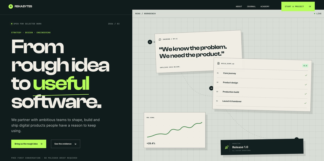
We wanted the first screen to make a different promise: bring the rough idea; we'll help turn it into useful software.
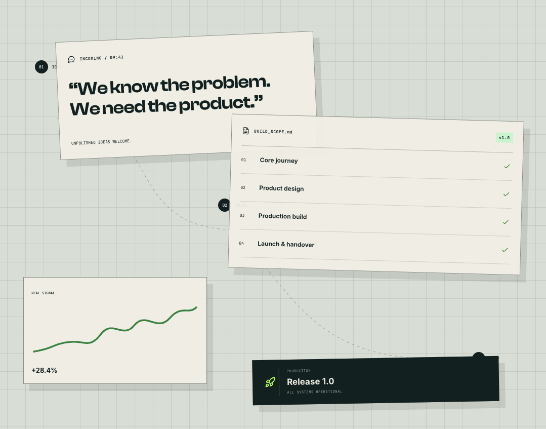
The workbench is a visual explanation of how an idea becomes a build. Its cards and numbers are illustrative, not client performance data.
The client, not the portfolio, goes first
The new opening line is about the journey from a rough idea to useful software. It does not ask visitors to understand our internal categories before they understand what we can do for them. Under it, the copy says plainly that we partner with teams to shape, build, and ship digital products people have a reason to keep using.
That change sounds like copywriting, but it changed the whole page. The primary action is now an invitation to bring us the rough idea. The secondary action lets someone see the evidence of our work. One path is for the person ready to talk; the other is for the person who needs confidence first. Neither asks them to pretend they already have a polished brief.
We carried the same thought into the project form. Starting a conversation should feel like the beginning of discovery, not an exam you have to pass before speaking to a studio. The form asks for enough to start well and leaves room for uncertainty.
A workbench, not a showroom
We tried quieter layouts. They were crisp, but they could have belonged to almost any studio. We also tried leaning much harder into 3D. It made the site memorable for the wrong reason: the object became the thing you looked at, while the service became a caption.
The workbench direction gave us a useful middle ground. The gridded surface, overlapping notes, build scope, and release card suggest that ideas get handled here. It has personality, but the big promise remains on the left, where a visitor can read it in a glance.
There is a tradeoff. Illustrative interface cards can look like evidence if we are careless. A chart on a homepage is not proof of a client's results just because it has a percentage on it. We need to keep the distinction between visual storytelling and real case studies clear. The workbench explains our process; the work itself has to earn trust elsewhere on the site.
One studio, one visual language
The redesign could not stop at the homepage. Someone might arrive through a journal article, visit the academy, read about us, or check a policy before getting in touch. If each page feels like it belongs to a different company, the first impression falls apart as soon as they click.
So we made the same visual decisions carry across those pages: strong type, generous spacing, a dark and lime palette, clearer actions, and navigation that stays out of the way. The journal remains more reading-focused; the academy still needs to explain its own offer. Consistency does not mean forcing every page into the same template. It means the same studio feels present wherever you enter.
We also removed details that were repeating the page title without helping anyone move around. A label in the middle of the navigation looked precise, but it competed with the links people actually use. Taking it out made the header calmer and the next action easier to see.
Better is a hypothesis until people use it
We think this direction is better because it answers the visitor's first questions faster: what do you do, can you help with my kind of problem, and what happens if I reach out? It gives the work room to support the promise instead of asking the work to be the promise.
But a stronger visual direction is not a conversion result. Large type can become overwhelming, a lively composition can hide weak copy, and a compact form can still ask the wrong questions. We'll judge the redesign by how easily real people understand it and start useful conversations—not by how good it looks in a screenshot.
If you're carrying an idea that isn't a brief yet, that's enough to begin. Tell us what you're trying to make.